How to Apply Branding in your MageNative Mobile App?
Branding your mobile app is very crucial for creating a strong visual identity of your brand that resonates with your customers. It adds value to your app’s design and keeps it aligned with your brand. This guide will show you how to customize and brand your app using MageNative Mobile App Builder.
Once you navigate to the “Brand It Your Way” Section of MageNative’s App Studio, you’ll have two options : App Setting and Color/Font.
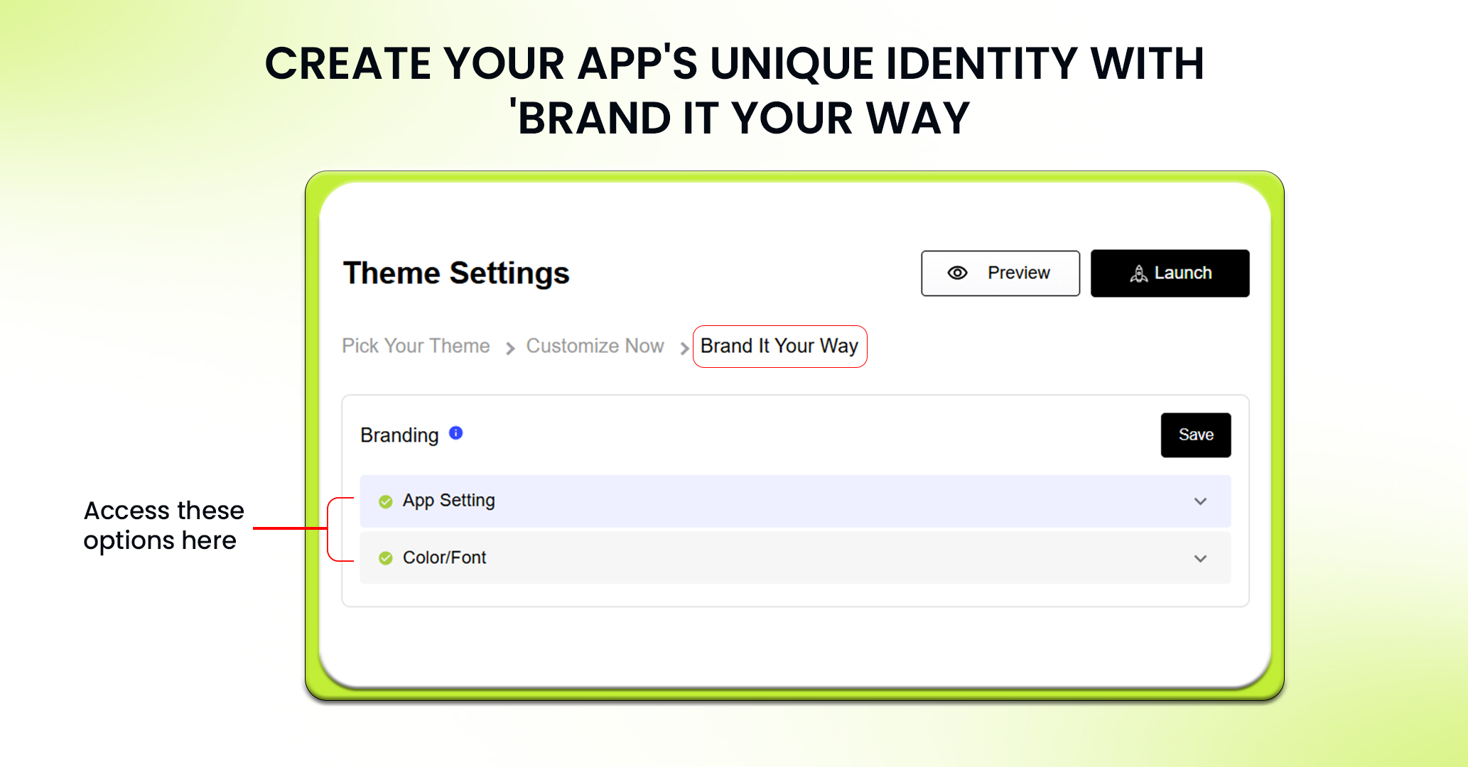
Let’s begin branding your mobile app with “App Setting”:
In the App Settings section, you have to give all the key information about your app to make sure it shows off your brand well:
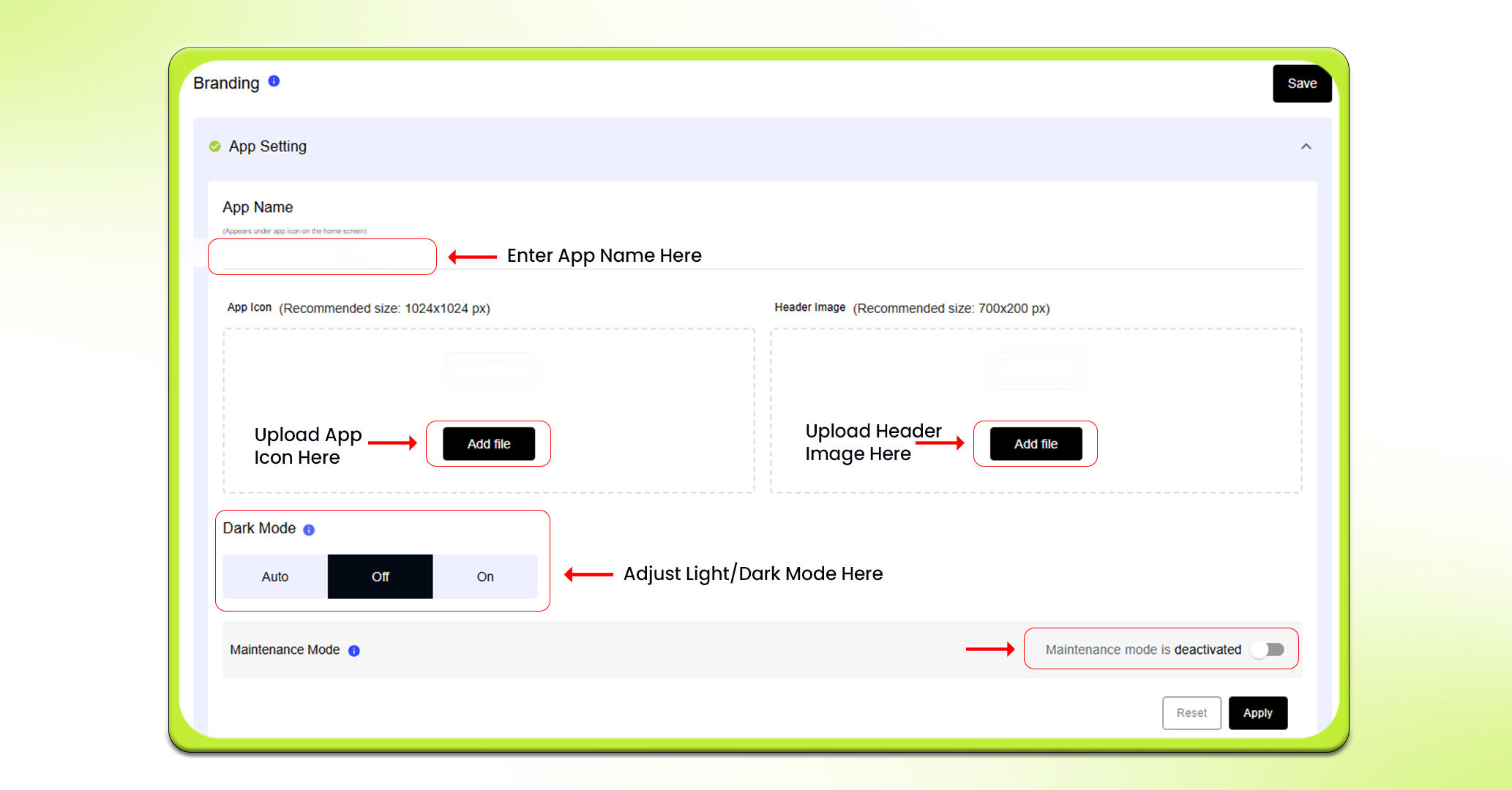
App Name
App name is the name that will appear under your app icon. Choose a name that aligns with your business well and makes it easy for your customers to recognize your app.
App Icon
Your app icon is like your app’s face on a mobile device. People identify your app with its logo. Make sure to upload an image that is exactly 1024 px by 1024 px to make your icon appear crisp and professional.
Header Image
Header image appears at the top of your app’s interface and gives it a unique look. Upload an image of 700 px by 200 px minimum. Always select an image that aligns with your brand’s personality.
Dark Mode
You can set this feature to Auto, Off, or On based on what suits your app best. Including a Dark Mode will make your app more visually appealing and easier viewing in low light environments.
Maintenance Mode
Sometimes you have to take an app down temporarily either because of updates or maintenance. With Maintenance Mode, you can show a message to your users letting them know that the app is temporarily unavailable or undergoing updates. Thus, maintaining transparency.
Now, Let’s move to Color/Font:
Color
Global Color
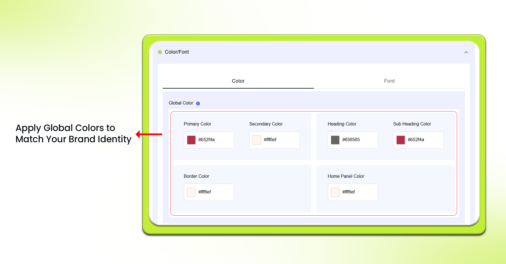
This is the main color that is used throughout your app. Choose a color that aligns with your brand. It includes:
- Primary Color: The main color used in the application for buttons, highlights, and key features.It should align with your brand identity.
- Secondary Color: This color is used for most text on buttons and other major features in the app. It should contrast the primary color to ensure readers can read the text.
- Border Color: This color will define the borders around items such as product tiles. A border will help to separate sections visually. The border color should coordinate with the primary and secondary colors.
- Heading and Subheading Colors: These are the colors used for headings and subheadings. Choose colors that are contrasting to the background and distinct from each other.
- Home Panel Color: The home panel color is the background color that will cover the entire screen of the app. Opt for a color that aligns with your overall theme.
Top Navigation Color
The Top Navigation Color section allows you to modify many aspects of your applications design.
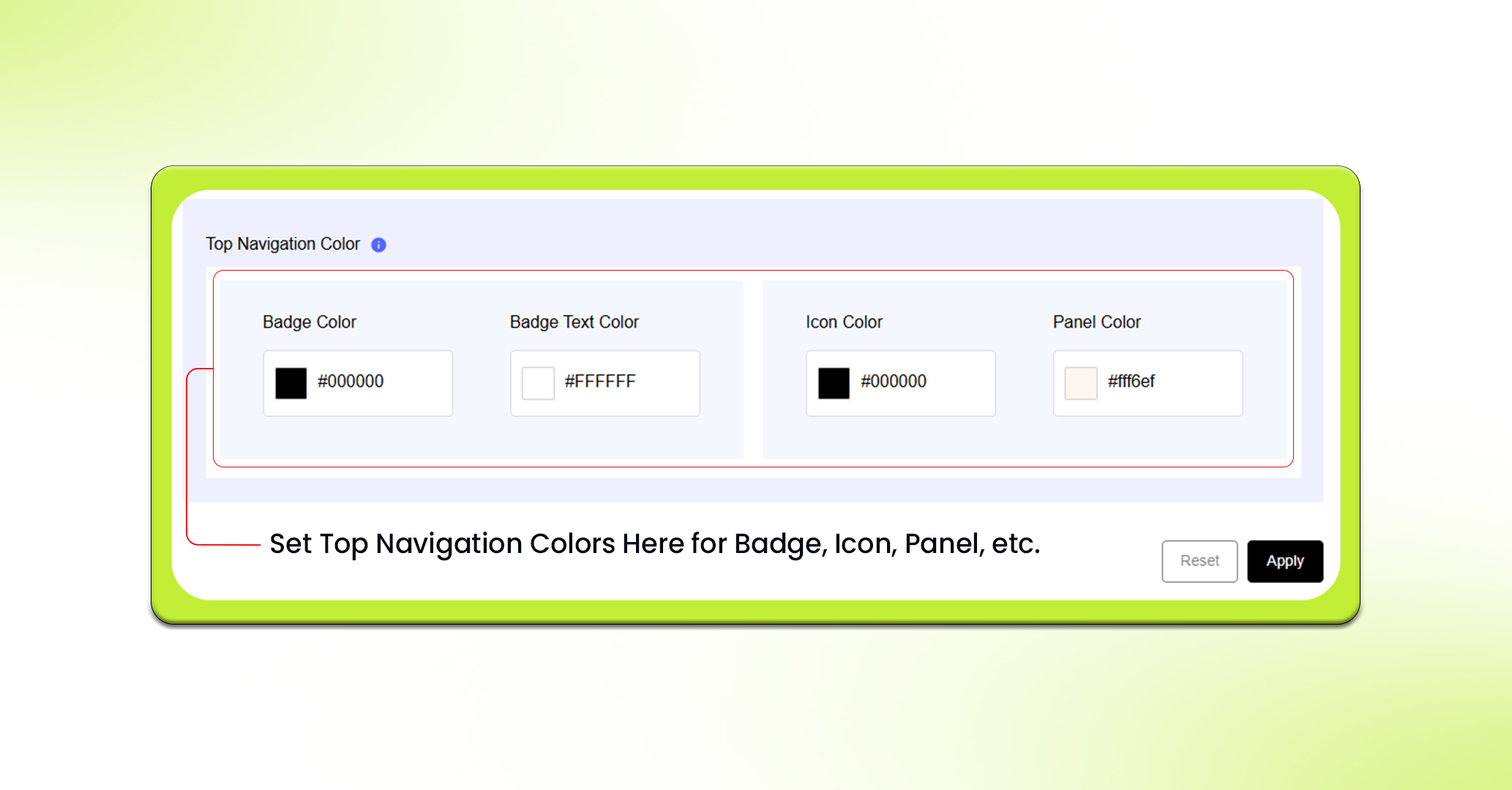
You can change the badge color to set it for the notification badges. Then you can select a badge text color for plaintext within those badges.
Similarly, you can use the icon color to choose the icon color in the navigation bar, and the panel color to change the color of the navigation bar background.
Fonts
Here you can set the fonts that will be used in your mobile app.
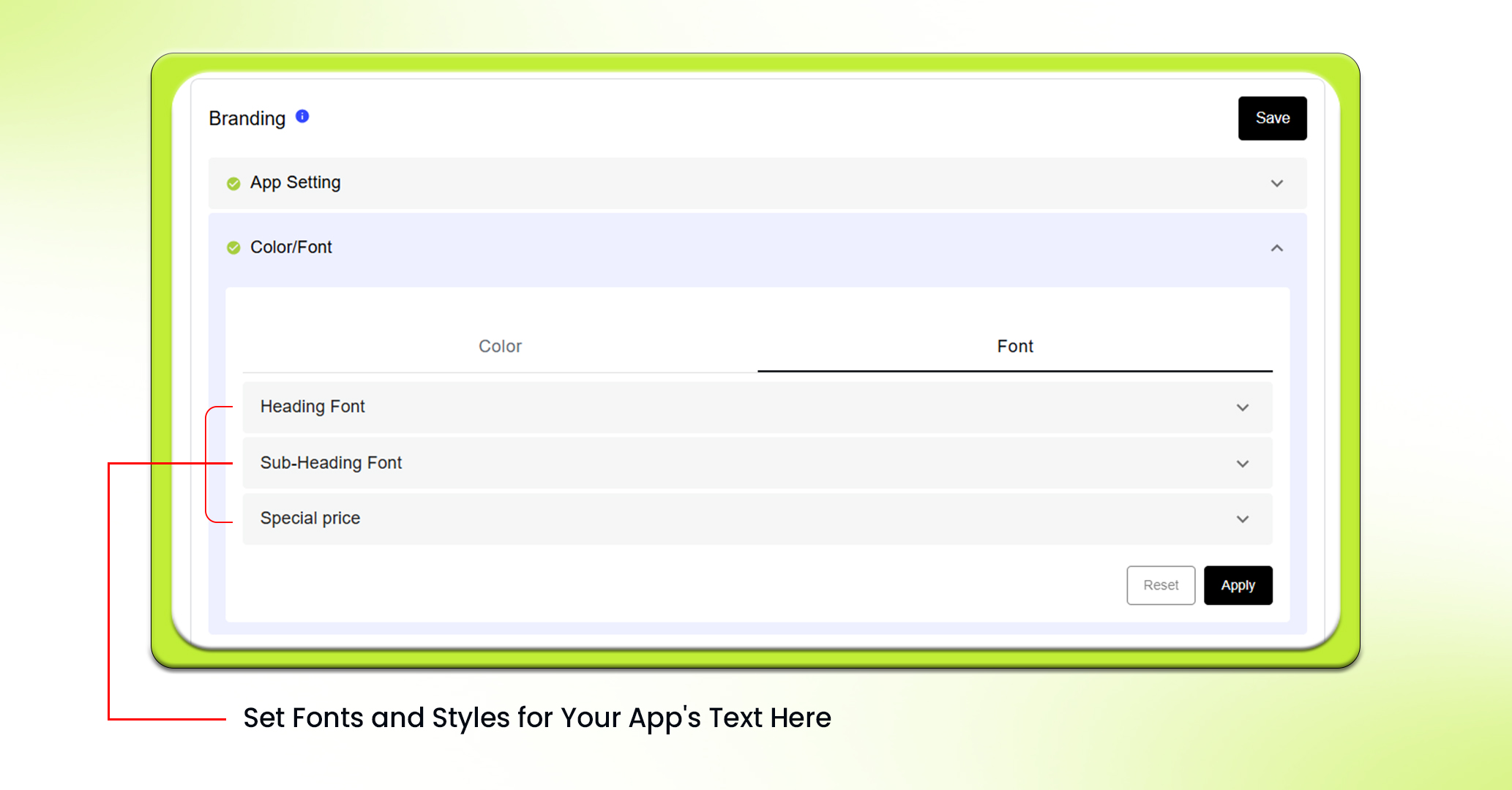
For now, “Poppins” is available for all kinds of text. You can select the preferred style: Normal or Italic, and weight: Light, Medium or Dark for each type of text: Heading, Subheading, Special Price.
Feel free to reach out to our support team if you have questions or need support. We are here to help and address any issues you may have!


